Brand guide and press kit
How Juried Art Services looks, and the files to make it look that way.
The mark and the rules it keeps, the lockups, the colors, the type and the words, with every logo file in vector, Retina and print resolutions. Use it for articles, event programs, partner pages and social posts. If something you need is not here, write to us.
The mark
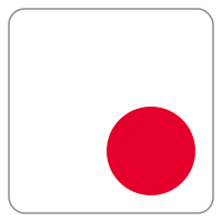
The dot, placed. In a gallery a red sticker on a white label means the work is sold, and that is the whole mark: a white label tile with its gray edge, and the red dot low and to the right, where a thumb puts it. Nothing else. The tile is always white, the dot is always red, and the dot is always in that corner, inside the border. It is the moment the brand exists for: an artist's work, sold.
Drawn on a 200-unit square. The tile is 184 wide with corners of radius 14 (7.6%); the dot is r 40, the one size, 43% of the tile's width, its edge 8.7% in from the tile's corner. The tile's edge is a hairline: 1.5 units of the wordmark gray, 0.8% of the tile, never thicker.
- Always white, always edged, and the edge is a hairline. The tile is #FFFFFF on every background, with an edge in the wordmark gray, the way a wall label has an edge. The edge is 1.5 units in the 200-unit box, 0.8% of the tile's width: a hairline, the thinnest line that still prints (0.3 px at the 38 px header, 1.2 px at 160 px). It never thickens into a border. Only the iOS app icon drops it, because iOS draws the icon's edge itself.
- Always red. The dot is #E4002B. It never takes a theme color, never softens in dark mode, never goes gray in print. One red, everywhere, like the sticker it is.
- One dot, one size. The dot is r 40 of the 200-unit box and nothing else: 80 across on a tile of 184. Jeffrey: "it can only be r 40 because that's balanced; it's the exactly quarter-sized dot in the tile." A smaller dot disappears, a larger one becomes a button. The dot alone may sit in a box as a callback to the logo, but the dot at other sizes is never used as the logo.
- Always bottom right, inside the border. Same place, same size, every time. The dot is not a badge that comes and goes; it is the mark. The top-right corner is reserved: a red dot there means a notification or an error, on every site, so the mark never puts one there.
- The name is locked to the box. To the right: left-aligned on the letters' ink, three lines, inset from the tile's top and bottom edges by 13% of the tile so the tile and the name read as two things, a mark and its name. Under: centered, the tile centered over the name, three lines, on dark surfaces only. Never one line under the box, never right-aligned, never floating free of the tile, never set edge to edge with the tile.
- Not a squircle. The logo is a rounded-corner square with straight edges, because it is an art label and labels have straight edges. The squircle is never one of the official logo designs. It is acceptable in exactly one place, the app icon, where the platform crops the tile into its home-screen grid; it is never drawn in a lockup, in print, on a card or on a site.
- The logo is the tile and the dot together. Never the dot alone. A round frame CONTAINS the tile: the whole tile sits inside the circle with air around it. The tile is never cut to a circle, and a squircle is never put in a circle either. That is the point.
- Print is matte. Business cards and every printed piece are matte stock, never gloss. The only shine in the system is the glint on a real sticker, and the mark does not draw one.
Geometry: the label is a rounded square, the squircle is a crop
The logo is not a squircle. It is a rounded square, straight sides and circular corners, because it represents an art label and a label has straight edges. A squircle is a different curve, the Lamé superellipse |x/a|n + |y/b|n = 1, where the side never goes fully straight. It is drawn here only so the difference is on record: the squircle is never one of the official logo designs. It is acceptable in exactly one place, the app icon, where the platform crops the tile into its home-screen grid (n = 5 is close to the iOS mask; n = 4 is the classic squircle). It is never used in a circle, and neither is the tile: a round frame contains the tile. For the site logo, print, cards and everything else: the rounded square with straight edges.
From 16 to 128
The dot holds at 16 px because it is a solid shape on a solid shape; nothing thins out. The edge thins to a gray rim and still says "label". Smallest sizes: 16 px on screen as a favicon, 24 px in interfaces, 8 mm in print.
16
24
32
48
64
96
128
16
24
32
48
64
96
128
Round frames
A round frame contains the tile. Where a site crops profile images to a circle, use the round-frame avatar files from the downloads: the disc is part of the image, ink or warm gray, with the whole tile inside it at 68%, so the crop shows the disc's edge and the tile within it, never a cut tile.
Never
Each of these was drawn so the reason could be written down. A red mark that is not exactly where it belongs is a red mark in the wrong place.
Lockups
The mark stands alone wherever the name is already known. Where the name must be read, the wordmark is locked to the tile: three lines of Archivo capitals, two quiet lines in the wordmark gray and one line in the sold red, and it never floats free of the box. The lockup is one drawing: the letters are outlined glyphs inside the same SVG as the tile, so no browser, system or user font can re-set them. One mark, two brands; the wordmark is the only thing that changes.
Text to the right
Left-aligned, inset from the tile: the top line's capitals start 24 units below the tile's top edge and the bottom line stands 24 units above its bottom edge, so the tile and the name read as two things, a mark and its name. Light or dark.
How the name sits beside the tile
Drawn in the tile's 200-unit box. The name's ink starts 56 units (30.4%) to the right of the tile, measured to each line's first letter, so J, A and S line up. Its first cap top sits 24 units (13%) below the tile's top edge and its last baseline the same distance above the bottom edge; between them the capitals are 32.24 units tall (17.5% of the tile), with 61% of a cap height from each baseline to the next cap top. Lined up with the tile's edges, the name looked bigger than the tile, because a white, hairline-edged, round-cornered label reads smaller than its box and a block of capitals reads bigger; inset, the two look the same size and read as two things. The ™ is 42% of the cap height, on the last line's cap line, spaced like the letters it follows. Smallest size: 45 px tall on screen; smaller, use the mark alone.
Text under
The three-line stack, each line centered under a centered tile, so the red line sits on the tile's axis. For dark surfaces only; on white the name goes to the right.
Why the name is never on one line under the box
Drawn and rejected, kept so the reason survives. On one line the red word is not the center of the line: in JURIED ART SERVICES the word SERVICES is longer than JURIED, so ART lands left of the tile's axis; in THE ARTIST SEEN it lands a little right. The eye takes the red as the anchor, finds it off the axis of the box and the dot, and reads the lockup as misaligned even though the whole line is mathematically centered. The three-line stack has no such problem. The red dashed line is the tile's axis; look where the red word falls. It is the same discipline as the top-right rule: a red mark that is not exactly where it belongs is a red mark in the wrong place.
Business cards
Matte stock, never gloss. The front is the label itself: no tile, the card's gray edge, the wordmark top left, the person at the bottom, and the red dot at the card's own bottom-right corner. The back is ink with the tile centered over the centered three-line name, which is what ties the dot on the front to the mark: turn the card over and the label you were holding is the logo.
juriedartservices.com
juriedartservices.com
theartistseen.com
theartistseen.com
Earlier drafts put the tile on the front beside the wordmark, or left the back as a white card with only the dot. The front of one and the back of the other survived, because the front should be the label and the back should name what the label belongs to.
Color
The mark has four colors and they are fixed. The dot is the sold red, the tile is white, the edge and the quiet lines of the wordmark are one gray, and ink is what everything sits on when the surface is dark. The mark never takes the viewer's chosen color and never wears a gradient; a lockup is exactly two colors, the gray and the red.
The dot, and the accent line of the wordmark. The gallery sticker red. It never takes a theme color and never wears a gradient.
The tile. Always white, on every background; the brightest thing on a dark screen, as a label is on a gallery wall.
The tile's edge and the two quiet lines of the wordmark: one gray, so a lockup is exactly two colors, this and the red.
Card backs and dark surfaces, and what the mark prints as in one color: the tile outlined, the dot solid.
The interface palette
The sites let every viewer choose a primary color for buttons, links and controls, six pop and six earth; Lime is the default. It colors the interface, never the mark. Shown so a designer knows what the mark will sit beside.
pop
earth
CMYK values are a plain conversion, a starting point for a printer, not a press proof. For print the red is the one to match; the tile is the paper.
Typography
Two faces. Open Sans carries everything people read, on every site and in every email. Archivo sets the wordmark only: three lines of capitals beside the tile, drawn as outlines inside the logo.
Open Sans — text
Archivo — the wordmark
About the company
Boilerplate at three lengths, ready to paste, and the facts behind it.
One line · 16 words
Juried Art Services is the online application and jurying platform for art shows, galleries and museums.
Standard · 47 words
Juried Art Services is the online application and jurying platform for art shows, galleries and museums. Artists apply and manage their portfolios in one place; organizers run applications, juries, payments and booth assignments on one system. It has served juried art shows for more than two decades.
Long · 78 words
Juried Art Services is the online application and jurying platform for art shows, galleries and museums. Artists apply to events, keep their portfolios and track results in one account; organizers set up events, collect applications, run juries with live scoring, take payments and assign booths without leaving the system. It has served juried events for more than two decades, from regional festivals to museum shows. The Artist Seen, its showcase, is where the same artists show their work.
The Artist Seen · 39 words
The Artist Seen is the showcase side of Juried Art Services: original work, straight from the artists who make it. Every artist on The Artist Seen is a working artist who applies to juried shows through the same platform.
| Serving | Art shows, festivals, galleries and museums for more than two decades |
| Founder | Paul Fisher |
| Co-founder | Jeffrey Gilbert |
| Brands | Juried Art Services (the platform) and The Artist Seen (the showcase) |
Writing the names
- Write "Juried Art Services" in full every time; never shorten it to initials.
- Write "The Artist Seen" with three capitals. It is Seen, never Scene.
- The mark needs no wordmark to be the logo; add the wordmark when the name must be read, locked to the tile.
- Never set the names in the sold red inside running text; the red belongs to the dot and the accent line.
- The Juried Art Services lockup carries ™ after SERVICES, and a piece's first prominent mention reads Juried Art Services™. Never use ®.
Press contact
Press and partnerships: arts@jurying.net
Or use the contact form; organizers wanting a walkthrough can schedule a demo.
Downloads
Every lockup in every colorway. SVG and PDF are vector and print at any size; the PNGs come at 1×, 2× and 3× for screens and at 2048 pixels, 300 dpi, for print. Backgrounds are transparent. The color files are the mark as it is; the one-color files outline the tile and fill the dot in ink or in white; the stacked lockups are for dark grounds. The round-frame avatars carry their own disc, so a site that crops profile images to a circle shows the whole tile inside it. The square icon is full bleed with no edge, for any square or squircle container that draws its own edge and corners; only the uncropped mark carries the hairline, so the edge is never applied twice.



























Generated October 31, 2026. Sizes: 1× is 256 px wide, 2× 512, 3× 768; print is 2048 px at 300 dpi, about 17 cm across. For anything larger, use the SVG or PDF.